Blog, potato (Solanum tuberosum)
Potato: Relationships Between Domesticated Species
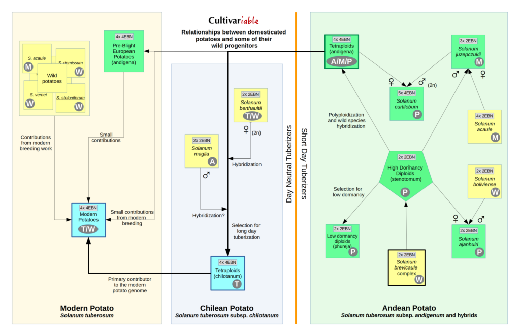
Being a fundamentally lazy person, I always prefer to search for work that has already been done by somebody else. That can be frustrating in the world of plant breeding, where information tends to come in two forms: highly technical or excessively simplified. There isn’t much middle ground. My search for a chart showing the relationships between the different species of domesticated potatoes came up empty, so I made my own.
I think this chart is a good compromise between too much and too little information. It isn’t perfect. The most accurate part of the chart is the Andean potato section. This does a pretty good job of showing where the modern potato came from, although a true representation of the contributors to the modern potato would be a spiderweb with strands going to almost every box on the chart. But, here in the middle ground between expertise and ignorance, it will serve.
The chart is hopefully pretty self explanatory. Andean domesticated potatoes are green, Chilean and modern potatoes are blue, and wild potatoes are yellow. The cytoplasm type of each group is contained in a circle. The gray box contains ploidy and EBN. The major domesticated groups have a dark border.

